March Mayhem 2025 – Dyers’ Competition 5th Anniversary!!!!
We are so excited to be in the fifth year of our annual Dyers'...

How we break down a reference image, select the dye color, and dye application style to best knit up like the reference image
Featuring: Knomad Bianca Fingering Weight 2 ply superwash merino
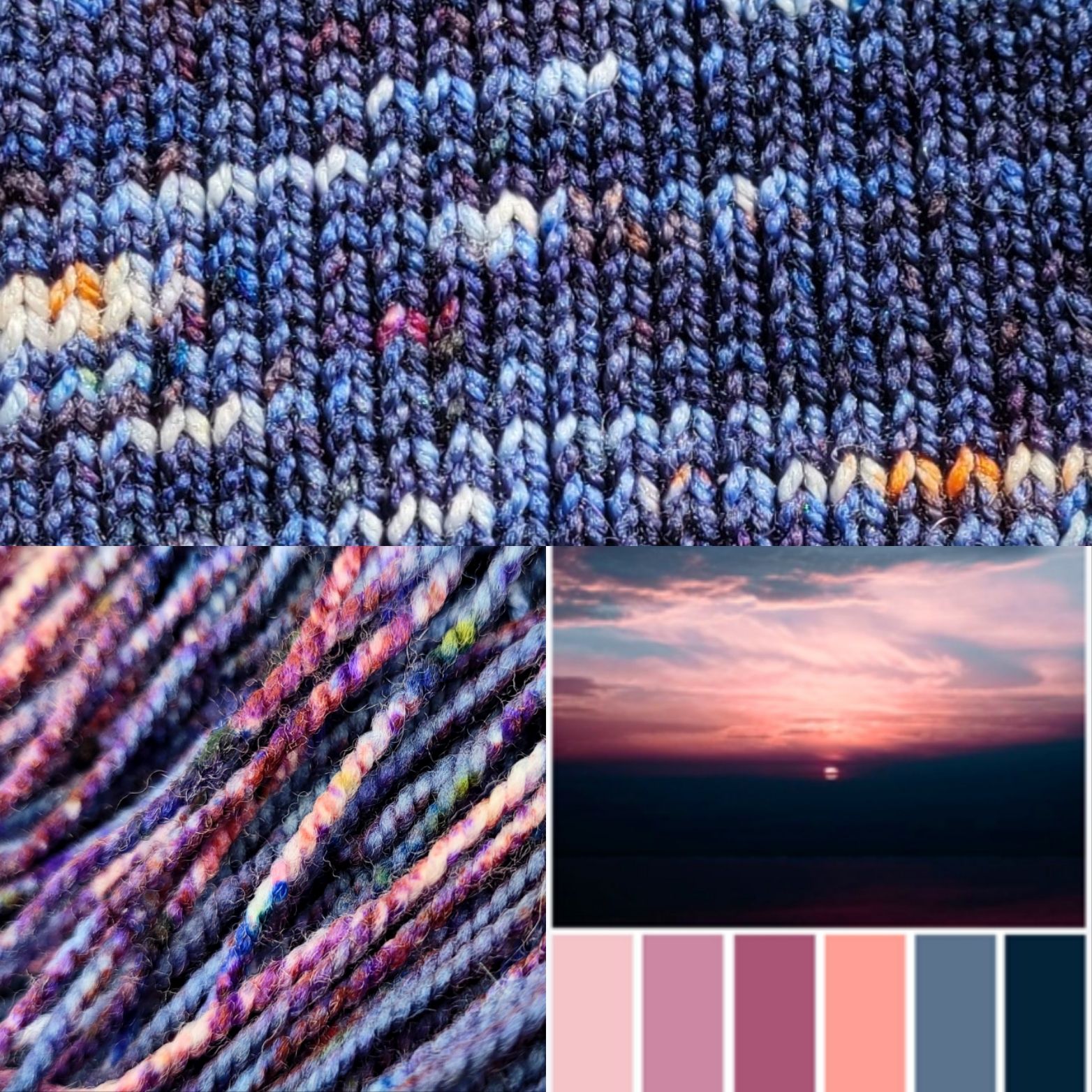
Our Goal: Take the sunset reference image, select the colors that best represent both the image and work well together, and select a dye application style that will knit up like the reference image.
Stressed for time and want an abstract? Here ya go:
Abstract: Using the “speckle and pop” dye application style, we will be doing a super low immersion background color (Pro Chem Sabraset Denim at 1.5% dos) and speckling in the closest milled dye colors over the intentional white space left across the top. This will give us the 75% “dark blue” space with little hints of orange, pink and purple with hazy little “white space” clouds strewn throughout the knitting. We will also get into why “derivative” colors (anything mixed at the mill instead of pure pigment primaries) break into weird colors.
For those with time to read the finer details, let’s dive in!
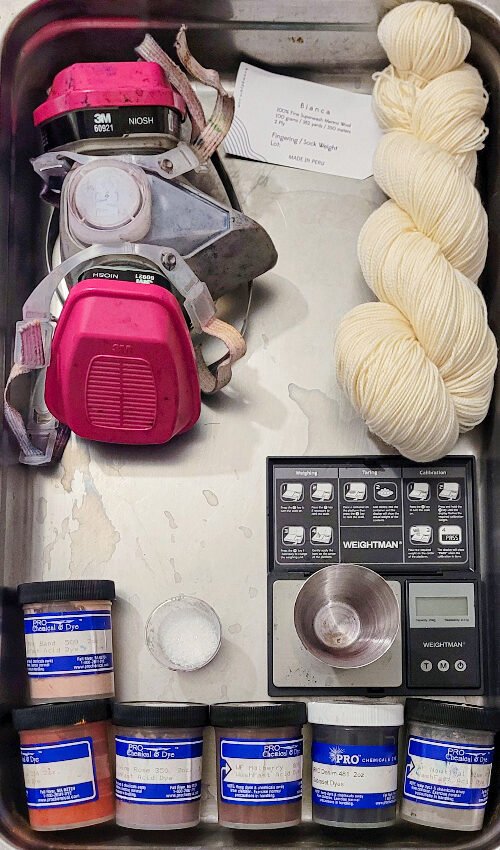
YOU WILL NEED:
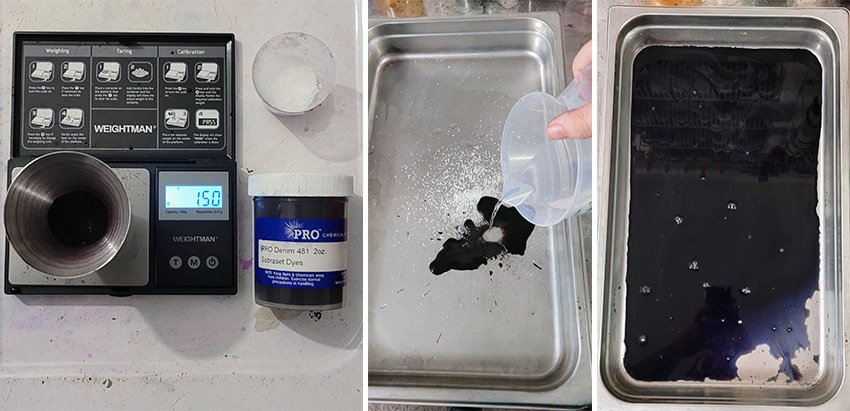
Starting with our background color of Denim, we will measure out 1.5% dos (degree of strength) into our hotel pan with a teaspoon of citric acid and 300 ml of hot water.
100 gram skein x .015 = 1.5 grams dye
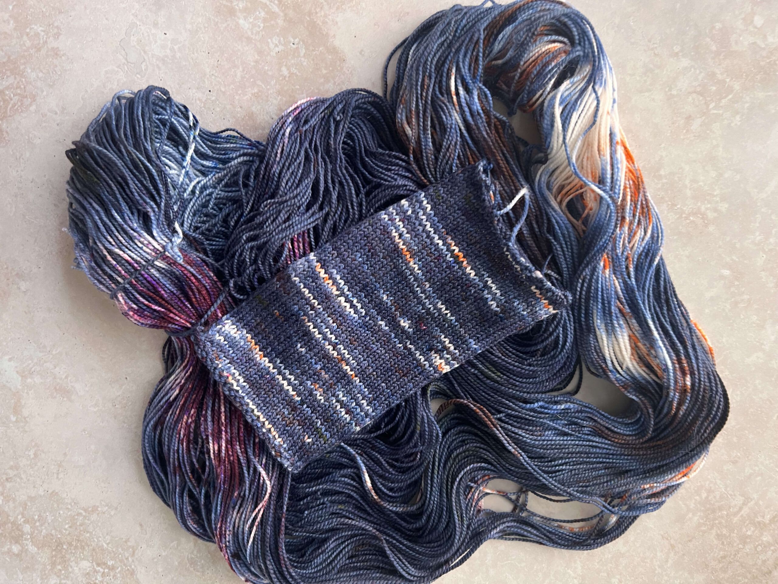
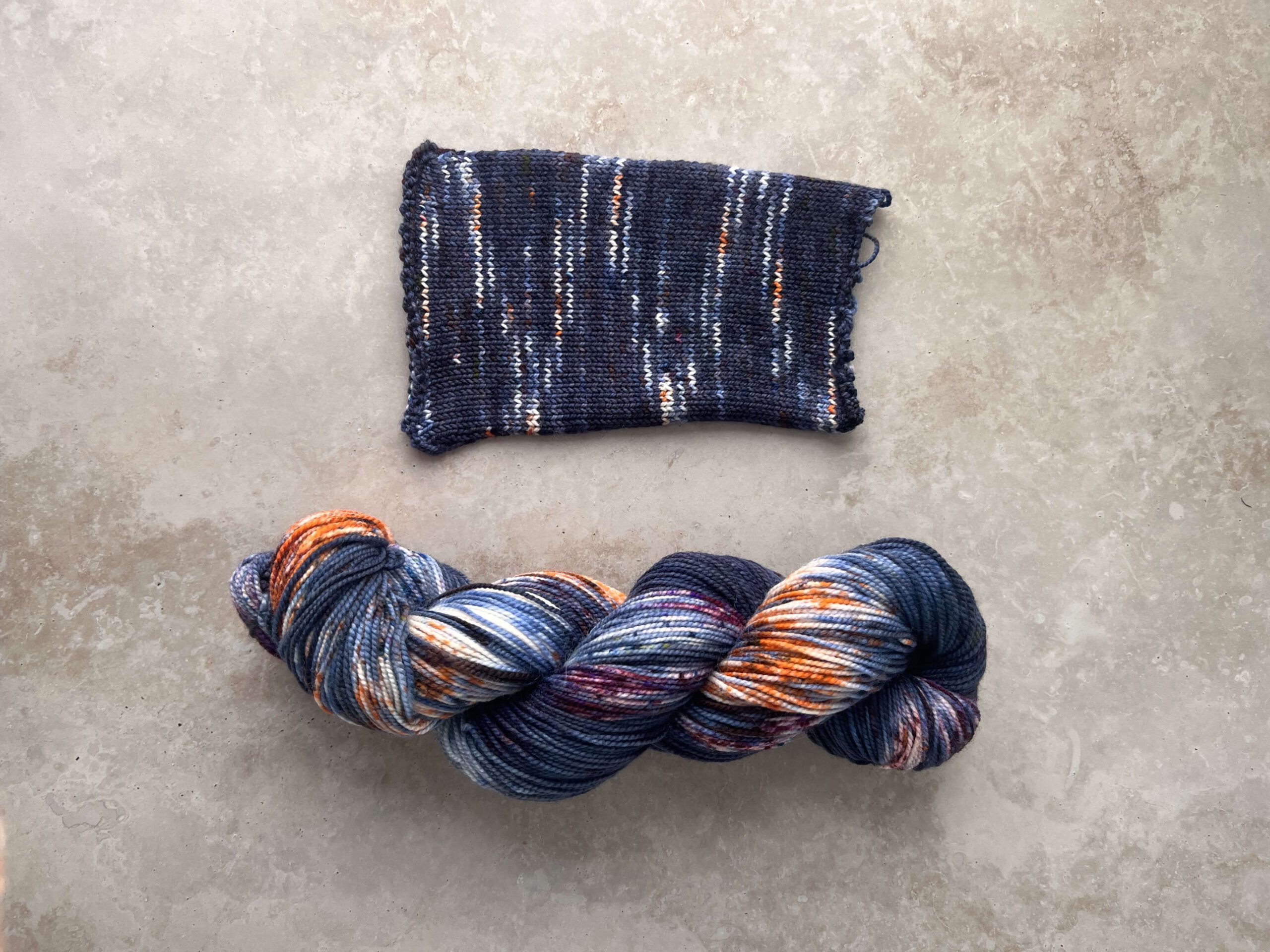
We will take our damp skein of Bianca, and carefully lay it in, leaving white space along the top for the speckles coming up in our next step.
I chose the “speckle and pop” method because I wanted 75% of the skein to be the deep blue color with small notes of pink, orange, and purple buried within the stitches, for a lower contrast effect. If I created a liquid painting stock and simply lay the colors next to each other, it would only resemble the image in the skein. Knit up, it would be highly variegated and in no way look like a sunset. If we only speckled, there would be so much white space, that it wouldn’t look like clouds at all.
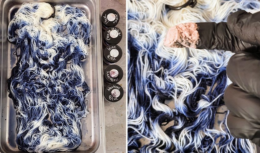
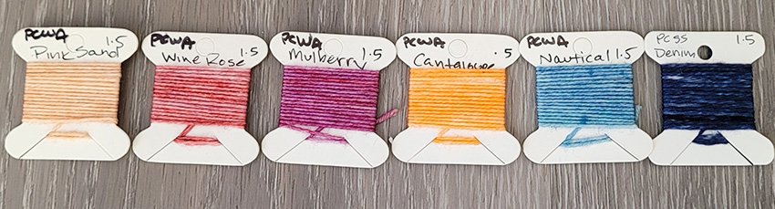
Speckle the colors in this order in segments down the length of the skein: pink sand, cantaloupe, wine rose, mulberry, and go over the entire skein with nautical at the end. You only need a “pinch” of dye, pictured here.
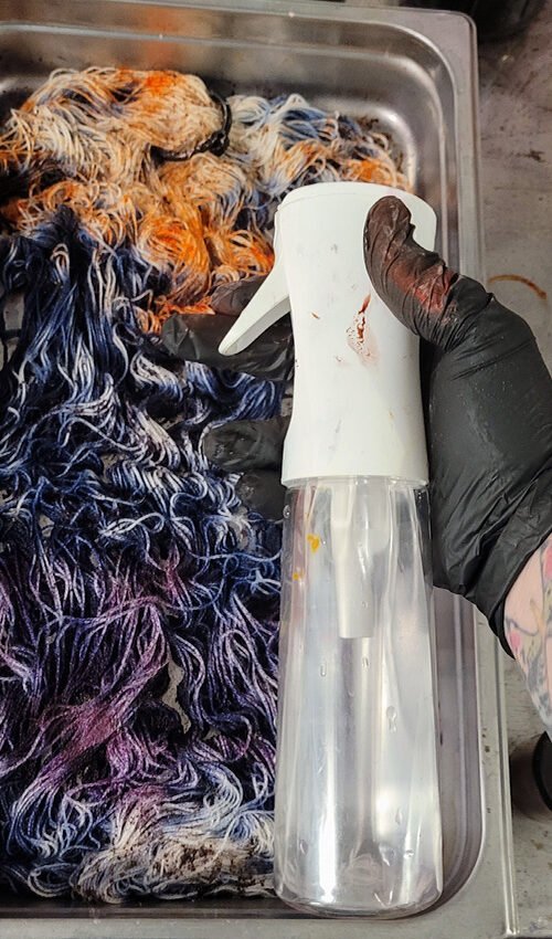
Now we take our continuous mist spray bottle (a tablespoon of citric acid melted in 500 ML of hot water) and spray over the top of the skein to melt the dye powder and help it fix in place. Heat set at 200 degrees in an oven, proofer, or veggie steamer for 30 mins, cool to room temperature and rinse.
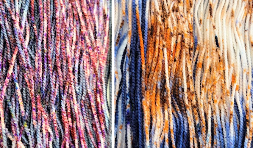
Here’s our wet speckles, close up – notice how the Cantaloupe broke brown? And the Pink Sand “disappeared”
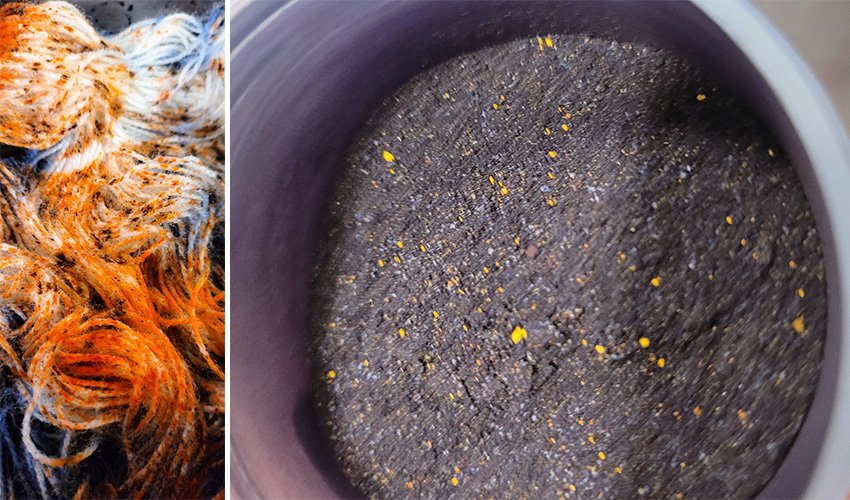
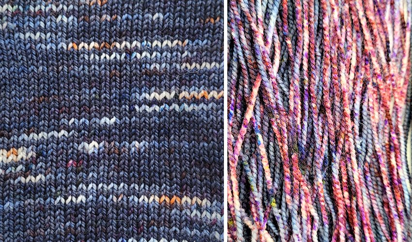
This is the color Denim: see all those tiny bits of yellow, blue, green and milky whitish blue bits? This dye is really just a derivative of primaries and some kind of filler to make the dye less saturated in color. And since some of these colors strike aka adhere to the yarn at different temperatures, this is why the dye looks patchy and you get breaking and weird third and fourth colors you weren’t expecting.
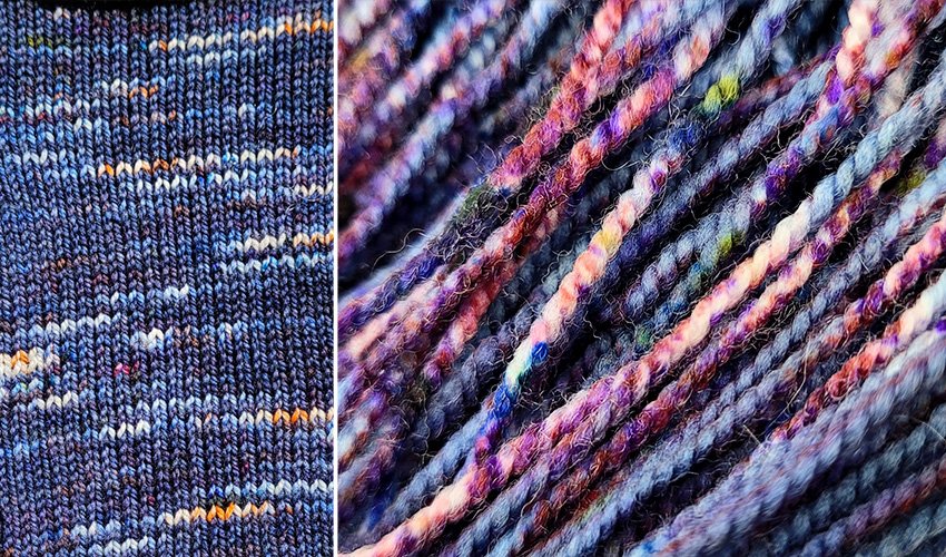
Notice how only the Cantaloupe really “pops” in the knit swatch, and the Wine Rose and Pink Sand colors disappeared completely against the Denim? It’s because all the different background colors they put in the Denim were nuetralized against the colors they used to make the Wine Rose and Pink Sand. Even though we left ample white space for the softer pinks to show up, they instead slightly shade shifted some of the blues. And check out all those greens and yellows in the speckling to the right!
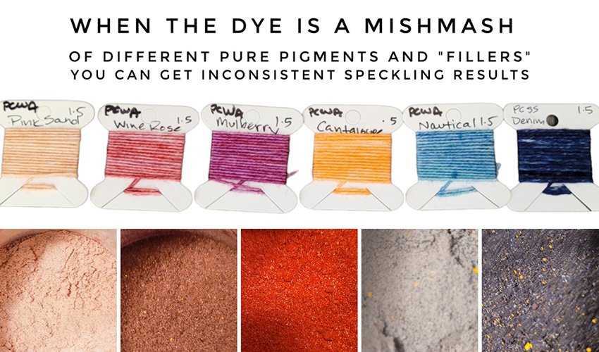
The key takeaway here is that not all dyes interact predictably, and unless it’s a pure pigment primary, you will get a fun little plot twist when you drop the dye powder over the skein. While the colors mix together to form a semi solid shade when immersion dyed, you get them in their component parts as a speckle. Which can be so fun! Or weird, or disappointing, depending on your expectations and desired color palette.
I hope this recipe and tutorial has informed your dye process, and inspired you to create your own sunset or sunrise yarn!
Til next time,
Nic